...posted on Sunday.
It didn't rain, much, last weekend. Well, OK, it rained like hell on Saturday, but Sunday was dry, more or less. Mostly less, but you get the idea. So, anyway, we decided to get the hell out of the house and drive up to Talkeetna - which is an artsy-fartsy tourist town about an hour north of here.
There's not much there, one street, some art shops, a lot of tourist geegaws, a couple of little places to eat, and the train stop. Still it's a neat place to go, and Beastly and I wanted to talk to the shop owners and see if they'd be interested in buying some of our woodwork (they were).
I stopped in the center of town and took a series of pictures. This last week, in my limited spare time, I've been playing with those pictures in Corel's Paint Shop Pro X2, which I like a whole hell of a lot better than Adobe's Photoshop.
I wanted to create a panoramic shot of main street.
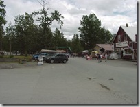
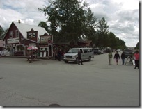
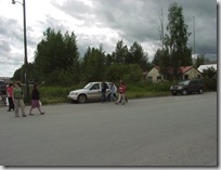
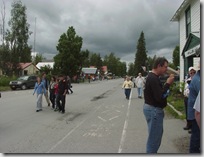
I started out with four pictures, taken with my Sony Professional DSC770. These pictures sweep down Main Street from south to north.
As you can see, it was a pretty bleak and gray day.
I created a 40"x 15" rastered background, and then using X2's layering function I positioned each picture on the background. Which the transparency of each picture set to 80%, it was easy to match the overlap points in order to create the initial panorama. I had to tweak the aspect ratio of the leftmost picture to get the edges of Nagley's Store to line up correctly.
Then I ran each individual layer through a black/white/gray bandpass filter in order to match each picture's color to a mean average and to lighten the overall picture a bit.
Once I was satisfied with the gray values, I flattened the layers, merging them into a single rastered image. Then it was a matter of using various tools to remove the obvious lines between each frame. Next I worked at the pixel level to remove duplicate artifacts and ghosts. Nothing irks me more than to look at a panoramic picture in a magazine like National Geographic and find blurred, ghostly duplicate images where the original photos have been stitched together. Now with that said, I did leave a couple of duplicate images, the girl in the plaid shorts and her friend in the green top, dead center in the image, appear twice. I could have removed one pair from the overall image, but I like the duplication in this case, so I left it.
Finally, I removed a couple of objects that tended to pull the eye away from the picture's overall flow. That dammed light pole dead center in the middle of the picture, for example. Then I cropped the image to final size and ran it through the Clarify filter. The clarify filter gives the overall image a much more dramatic tone, especially the stormy sky. Yes, the color is a tad yellowish and obviously pushed the overall picture in more artificial direction - and that's what I wanted here. This is not a true picture, obviously, it's a combination of photography and computer artwork and the final result I think is dammed cool.
Clicking on the image will take you to a full-sized, hi-res image in my Picasa album


I was going to ask where the new banner pic came from. Well done!
ReplyDeleteI like it, nice job! I've always had a hard time unifying the light values since my camera changes the light metering from shot to shot. (I could manually set that but I'd have to read the instructions first).
ReplyDeleteI like Talkeetna, it's fun to visit - and our favorite fishing spot is Clear Creek, so we take a shuttle boat upriver from Talkeetna to the mouth of the creek. The Talkeetna river skippers are scary/amazing, that river is nuts to pilot it's so fast and silty and full of snags & trees and gravel bars.
Anyway, glad you enjoyed your trip.
I noticed the change yesterday, and was wondering if you were going to say anything about it.
ReplyDeleteNeat!